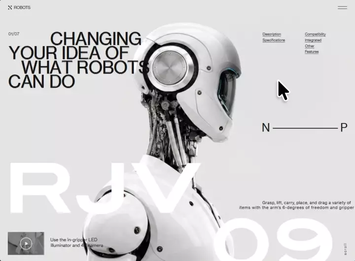
类型:Site模板 · 分类:未分类 · 收录:2026-09-03 19:57:57 · 源码:会员可见
付费可阅读内容 · 可复制
Build a single self-contained HTML file (no build step, no frameworks, no external JS
libraries) that reproduces the "RJV-09" robot hero page exactly as specified below.
Everything — CSS, markup, and three vanilla-JS IIFEs — lives in that one file. The only
external requests are two font stylesheets and three images.

═══════════════════════════════════════════════════════════════════════════════
0. ASSETS — use these EXACT URLs verbatim
═══════════════════════════════════════════════════════════════════════════════
FONTS — both <link> tags go in <head>, before the <style>:
<link href="https://db.onlinewebfonts.com/c/65a40d16161c5040b3ae31036979a1db?family=ITC+Blair+W04+Bold" rel="stylesheet">
<link href="https://db.onlinewebfonts.com/c/6e47ef470dd19698c911332a9b4d1cf4?family=Neue+Haas+Grotesk+Text+Pro" rel="stylesheet">
  Declared family names are exactly "ITC Blair W04 Bold" and "Neue Haas Grotesk Text Pro".
  BOTH ship a single face at font-weight:normal. Therefore NEVER request weight 800/750/700
  from either — that only triggers a synthetic bold on top of an already-bold design.
  Display face  = ITC Blair W04 Bold  -> the RJV / 09 wordmark ONLY.
  Text face     = Neue Haas Grotesk Text Pro -> body, headline, nav, captions, everything else.
  Fallback stack for both: Helvetica, Arial, sans-serif.

IMAGES:
BASE_HERO_IMG  (light/white robot, 16:9, centred on a flat #E7E7E7 ground):
https://d8j0ntlcm91z4.cloudfront.net/user_38xzZboKViGWJOttwIXH07lWA1P/hf_20260826_125315_3aa52299-a4de-4c7d-b0d4-19527591eae7.png

REVEAL_IMG     (same robot/pose/framing/ground, restyled matte-black + gunmetal grey with
                cyan glow seams — this is what the spotlight reveals):
https://d8j0ntlcm91z4.cloudfront.net/user_38xzZboKViGWJOttwIXH07lWA1P/hf_20260826_151234_c1af372b-3eeb-47a2-b1b4-5ae98f92e167.png

THUMB_IMG      (in-gripper camera still, inside the play button):
https://d8j0ntlcm91z4.cloudfront.net/user_38xzZboKViGWJOttwIXH07lWA1P/hf_20260826_125021_b092924a-9fc3-4368-b996-38d281b4cdd1.png

THERE IS NO VIDEO ON THIS PAGE. There is no CloudFront video URL, no .mp4, no .m3u8.
The play button is THUMB_IMG plus a decorative SVG glyph. Do not add a <video> element
or a player of any kind.

LOCAL (optional, portrait only): assets/robot-rjv09.webp — a transparent-background robot
cut-out used ONLY by the mobile layout. Give it onerror="this.style.display='none'" so the
file stays standalone: without it, portrait falls back to flat ground + spotlight reveal,
which is the intended portrait behaviour anyway.

═══════════════════════════════════════════════════════════════════════════════
1. DOCUMENT HEAD
═══════════════════════════════════════════════════════════════════════════════
<!DOCTYPE html>, <html lang="en">, charset utf-8.
<meta name="viewport" content="width=device-width,initial-scale=1,viewport-fit=cover">
<title>RJV-09 — Changing your idea of what robots can do</title>   (— is an em dash)

═══════════════════════════════════════════════════════════════════════════════
2. THE SCALE SYSTEM — the core architecture, implement literally
═══════════════════════════════════════════════════════════════════════════════
The desktop composition is authored against a 1280 x 712 reference grid. One token, --k,
converts a design unit into CSS px. It never exceeds the width budget (the grid is never
compressed) and never exceeds the height budget (nothing is ever cropped). Because the
ground is a flat fill and the robot bleeds off the bottom edge, surplus height is simply
more background — never a letterbox bar.

:root{
  --kw: calc(100vw / 1280);
  --kh: calc(100vh / 712);
  --k:  min(var(--kw), var(--kh));
  --kr: min(var(--kh), calc(var(--k) * 1.45));   /* robot: fills height, capped */
  --kt: var(--k);                                /* UI/type scale: == --k until tablet */
  --slack: calc(100% - 712 * var(--k));          /* surplus height, vertical use only */
  --bg:#E7E7E7;
}
@supports (height:100dvh){ :root{--kh: calc(100dvh / 712)} }

*,*::before,*::after{box-sizing:border-box}
html,body{margin:0;padding:0;height:100%;overflow:hidden;background:var(--bg)}
body{font-family:'Neue Haas Grotesk Text Pro',Helvetica,Arial,sans-serif;-webkit-font-smoothing:antialiased}
img{-webkit-user-drag:none;user-select:none}
:focus-visible{outline:2px solid #1A1A1A;outline-offset:3px}

═══════════════════════════════════════════════════════════════════════════════
3. LAYER STACK
═══════════════════════════════════════════════════════════════════════════════
#viewport{position:fixed;inset:0;overflow:hidden;
  background:var(--bg) url('BASE_HERO_IMG') center/cover no-repeat}
#spotlight{position:absolute;inset:0;
  background:url('REVEAL_IMG') center/cover no-repeat;pointer-events:none;
  -webkit-mask-repeat:no-repeat;mask-repeat:no-repeat;
  -webkit-mask-size:100% 100%;mask-size:100% 100%}

DOM order inside #viewport:  <div id="spotlight"></div>, then <div id="stage">…</div>,
then <div id="mobile">…</div>.  #spotlight sits BELOW the text layers on purpose, so the
reveal happens behind the type and the copy stays crisp.

#stage{position:absolute;inset:0;overflow:hidden}
.tx{position:absolute;white-space:nowrap;line-height:1;font-weight:400;z-index:3}
.hl{position:absolute;left:0;right:0;overflow:hidden;pointer-events:none;z-index:3}
.wm{position:absolute;white-space:nowrap;line-height:1;color:#fff;transform-origin:0 0;z-index:2}
#robot{position:absolute;z-index:1;
  width:calc(587.69 * var(--kr));height:calc(801.65 * var(--kr));
  left:calc(50% + 34.845 * var(--k) - 293.845 * var(--kr));
  top:calc(100% - 697 * var(--kr))}
IMPORTANT: the desktop robot is baked into BASE_HERO_IMG, so <img id="robot"> stays in the
DOM (the entrance timeline targets it) but carries inline style="display:none".

═══════════════════════════════════════════════════════════════════════════════
4. DESKTOP MARKUP + EXACT POSITIONS (all inside #stage)
═══════════════════════════════════════════════════════════════════════════════
4a. WHITE WORDMARK — five .wm spans with data-g attributes, ITC Blair W04 Bold.
    ALL five: font-size:calc(244.9 * var(--k)); color #fff; transform:scaleX(1).
    CRITICAL: scaleX MUST be 1. Do not reintroduce the 1.06505/1.278/1.11583/1.2 stretches
    from older revisions — those compensated for narrower substitute faces, and applying
    them to Blair (a genuinely wide face) makes every glyph pair collide.
    The anchors below are derived from Blair's real advance widths at ZERO added tracking:
      data-g="gR" "R" left:calc(11 * var(--k))          top:calc(100% - 388 * var(--k))
      data-g="gJ" "J" left:calc(269 * var(--k))         top:calc(100% - 388 * var(--k))
      data-g="gV" "V" left:calc(473 * var(--k))         top:calc(100% - 388 * var(--k))
      data-g="g0" "0" left:calc(100% - 530 * var(--k))  top:calc(100% - 187 * var(--k))
      data-g="g9" "9" left:calc(100% - 295 * var(--k))  top:calc(100% - 187 * var(--k))
    Each carries inline font-family:'ITC Blair W04 Bold'.
    R and 9 are the fixed anchors (left-most and right-most); J, V and 0 are derived.

4b. <img id="robot" alt="RJV-09 humanoid robot in three-quarter profile"
        src="assets/robot-rjv09.webp" style="display:none">

4c. <svg id="logomark" viewBox="0 0 13 14" aria-hidden="true"> — four dots + a diagonal:
      <path d="M2.1 2.1 L10.6 10.1" stroke="#2B2B2B" stroke-width="2.4" fill="none"/>
      <g fill="#2B2B2B"><circle cx="1.9" cy="1.9" r="1.9"/><circle cx="11.1" cy="1.9" r="1.9"/>
      <circle cx="1.9" cy="12.1" r="1.9"/><circle cx="11.1" cy="12.1" r="1.9"/></g>
    #logomark{position:absolute;z-index:3;left:calc(31 * var(--kt));top:calc(23 * var(--kt));
      width:calc(13 * var(--kt));height:calc(14 * var(--kt))}

4d. BRAND, data-k="brand", text "ROBOTS":
    left:calc(51 * var(--kt));top:calc(23 * var(--kt));font-size:calc(15.1 * var(--kt));
    letter-spacing:-0.0662em;color:#2B2B2B

4e. BURGER — <details id="menu"><summary aria-label="Menu" role="button"></summary>
    <div id="menupanel"><div class="mp-col"><a>Description</a><a>Specifications</a></div>
    <div class="mp-col"><a>Compatibility</a><a>Integrated</a><a>Other</a><a>Features</a></div>
    </div></details>
    #menu{position:absolute;z-index:6;left:calc(100% - 65 * var(--kt));top:calc(25.9 * var(--kt));
      pointer-events:none}                    /* inert on desktop — the six links are visible */
    #menu>summary{display:block;list-style:none;cursor:default;
      width:calc(33 * var(--kt));height:calc(8.6 * var(--kt));
      background:linear-gradient(#3A3A3A 0 0) top/calc(33 * var(--kt)) calc(1.6 * var(--kt)) no-repeat,
                 linear-gradient(#3A3A3A 0 0) bottom/calc(33 * var(--kt)) calc(1.6 * var(--kt)) no-repeat}
    #menu>summary::-webkit-details-marker{display:none}
    #menu>summary::marker{content:''}
    #menupanel{display:none}                  /* desktop only */

4f. COUNTER, data-k="counter", text "01/07":
    left:calc(31 * var(--kt));top:calc(118 * var(--kt));font-size:calc(15.1 * var(--kt));
    letter-spacing:0em;color:#3A3A3A

4g. HEADLINE — one <h1 style="margin:0;font-weight:400"
        aria-label="Changing your idea of what robots can do">.
    Inside: FOUR .hl line-clip wrappers, each holding per-letter .tx spans that are
    aria-hidden="true" and keyed data-k="L01".."L33". Write the spans back-to-back with NO
    whitespace between them.
    EVERY letter span: top:0; font-size:calc(61.73 * var(--kt)); letter-spacing:0em;
      color:#111111; -webkit-text-stroke:0.0138em #111111.
    Each .hl: height:calc(61.73 * var(--kt)), tops as listed.
    LEFT values are left:calc(N * var(--kt)) with N below. These are derived from Neue Haas
    Grotesk Text Pro's real advance widths, then tightened by 1.5 design units per step
    cumulatively (so each line's FIRST letter keeps its original indent and the tightening
    accumulates rightward). Word gaps use the font's own space advance (16.4u) before the
    tightening is applied.
      LINE 1  top:calc(111 * var(--kt))   "CHANGING"
              C181  H227  A271  N313  G356  I404  N418  G462
      LINE 2  top:calc(161.7 * var(--kt)) "YOUR IDEA OF"
              Y32  O73  U122  R164 | I222  D237  E280  A320 | O378  F428
      LINE 3  top:calc(213.5 * var(--kt)) "WHAT ROBOTS"
              W77  H136  A179  T222 | R276  O319  B368  O409  T458  S498
      LINE 4  top:calc(265 * var(--kt))   "CAN DO"
              C30  A76  N117 | D178  O221
    (The | marks show where a word break falls; there are no space characters in the markup.)

4h. SIX NAV LINKS — <a class="tx nav" data-k="nv1".."nv6" href="#">.
    All: font-size:calc(13.4 * var(--kt)); color:#333333.
      nv1 Description    left:calc(100% - 336 * var(--kt)) top:calc(118 * var(--kt)) ls -0.0373em
      nv2 Specifications left:calc(100% - 336 * var(--kt)) top:calc(139 * var(--kt)) ls -0.0402em
      nv3 Compatibility  left:calc(100% - 184 * var(--kt)) top:calc(118 * var(--kt)) ls -0.0373em
      nv4 Integrated     left:calc(100% - 184 * var(--kt)) top:calc(139 * var(--kt)) ls -0.0332em
      nv5 Other          left:calc(100% - 184 * var(--kt)) top:calc(160 * var(--kt)) ls -0.0373em
      nv6 Features       left:calc(100% - 184 * var(--kt)) top:calc(181 * var(--kt)) ls -0.0533em
    .nav{text-decoration:underline;text-decoration-thickness:.0746em;
         text-underline-offset:.1866em;text-decoration-color:#5A5A5A}
    a.nav{color:inherit}

4i. PREV/NEXT — data-k="npn" "N", #nprule, data-k="npp" "P".
    npn: left:calc(100% - 339 * var(--kt)); top:calc(327 * var(--kt) + var(--slack) * .5);
         font-size:calc(39.8 * var(--kt));letter-spacing:0em;color:#1A1A1A
    npp: left:calc(100% - 57 * var(--kt));  top: same as npn; same type
    #nprule{position:absolute;z-index:3;left:calc(100% - 299 * var(--kt));
      top:calc(347.6 * var(--kt) + var(--slack) * .5);
      width:calc(233 * var(--kt));height:calc(1.8 * var(--kt));background:#1A1A1A}

4j. BODY COPY — one <p style="margin:0"> with two .tx spans, colour #1F1F1F,
    font-size:calc(15.1 * var(--kt)):
    data-k="bd1" "Grasp, lift, carry, place, and drag a variety of"
      left:calc(100% - 337 * var(--kt)); top:var(--bd1-top,calc(100% - 218 * var(--kt)));
      letter-spacing:0.0183em
    data-k="bd2" "items with the arm's 6-degrees of freedom and gripper"  (curly apostrophe)
      left:calc(100% - 420 * var(--kt)); top:var(--bd2-top,calc(100% - 200 * var(--kt)));
      letter-spacing:0.0408em

4k. PLAY BUTTON (static image, NOT a video):
    <button id="thumb" aria-label="Play in-gripper camera clip">
      <img alt="" src="THUMB_IMG"></button>
    <svg id="play" viewBox="0 0 43 43" aria-hidden="true">
      <circle cx="21.5" cy="21.5" r="20.75" fill="none" stroke="#fff" stroke-width="1.5"/>
      <path d="M18.6 15.2 L28.3 21.5 L18.6 27.8 Z" fill="#fff"/></svg>
    #thumb{position:absolute;z-index:3;left:calc(30 * var(--kt));top:calc(100% - 105 * var(--kt));
      width:calc(131 * var(--kt));height:calc(82 * var(--kt));overflow:hidden;
      background:#9a9a9a;border:0;padding:0;cursor:pointer}
    #thumb img{width:calc(132 * var(--kt));height:calc(83 * var(--kt));
      margin:calc(-3 * var(--kt)) 0 0 calc(-3 * var(--kt));object-fit:cover;display:block}
    #play{position:absolute;z-index:4;left:calc(74 * var(--kt));top:calc(100% - 85 * var(--kt));
      width:calc(43 * var(--kt));height:calc(43 * var(--kt));pointer-events:none}
    Captions: data-k="cp1" "Use the in-gripper LED"  left:calc(182 * var(--kt))
      top:calc(100% - 85 * var(--kt)) font-size:calc(16.4 * var(--kt)) ls -0.0145em color:#242424
    data-k="cp2" "illuminator and 4K camera"  left:calc(183 * var(--kt))
      top:calc(100% - 65 * var(--kt)) same size, ls -0.0229em

4l. <div id="scroll">scroll</div>
    #scroll{position:absolute;z-index:3;left:calc(100% - 46 * var(--kt));
      top:calc(100% - 67 * var(--kt));font-size:calc(12.2 * var(--kt));
      letter-spacing:0.1803em;color:#3A3A3A;transform-origin:0 0;
      transform:rotate(-90deg) translateX(-100%);line-height:1;white-space:nowrap}

═══════════════════════════════════════════════════════════════════════════════
5. TABLET ARCHITECTURE  @media (max-width:1139px),(max-height:633px)
═══════════════════════════════════════════════════════════════════════════════
Rationale to preserve: the composition never collides, so the first thing to fail is type.
The six-link cluster hits its 12px legibility floor at k=0.896 (1146px wide / 638px tall).
The links force the architectural change; 1139px/633px is where it happens.

:root{ --kt: max(var(--k), min(.89px, calc(var(--k) * 1.3)));   /* continuous at k=.89 */
       --bd1-top: calc(118 * var(--kt));    /* paragraph takes the vacated column */
       --bd2-top: calc(136 * var(--kt)); }
#stage .nav{display:none}
#menu{pointer-events:auto}
#menu>summary{cursor:pointer;position:relative}
#menu>summary::before{content:'';position:absolute;inset:calc(-14 * var(--kt)) calc(-9 * var(--kt))}
#menupanel{display:grid;position:absolute;right:0;top:calc(30 * var(--kt));
  grid-template-columns:repeat(2,max-content);gap:0 calc(52 * var(--kt));
  padding:calc(22 * var(--kt)) calc(26 * var(--kt));background:#E7E7E7;
  border:1px solid rgba(26,26,26,.16);
  animation:mp .16s cubic-bezier(.2,.7,.3,1) both}
#menupanel .mp-col{display:flex;flex-direction:column}
#menupanel a{color:#333;white-space:nowrap;font-size:calc(13.4 * var(--kt));
  letter-spacing:-.0373em;padding:calc(9 * var(--kt)) 0;text-decoration:underline;
  text-decoration-thickness:.0746em;text-underline-offset:.1866em;text-decoration-color:#5A5A5A}
#thumb{padding:0}
@keyframes mp{from{opacity:0;transform:translateY(-3px)}}
Plus a (prefers-reduced-motion:reduce) twin for both queries setting #menupanel{animation:none}.

═══════════════════════════════════════════════════════════════════════════════
6. PORTRAIT / MOBILE  @media (max-aspect-ratio:11/10)
═══════════════════════════════════════════════════════════════════════════════
#mobile{display:none} by default. Inside the portrait query:
  #stage{display:none}
  #viewport{background:var(--bg)}   /* CRITICAL: hero photo hidden in portrait — imagery
                                       appears ONLY where the spotlight reveals it */
  #mobile{display:grid;position:absolute;inset:0;height:100%;
    grid-template-rows:auto auto minmax(0,1fr) auto;overflow:hidden;
    --pad:clamp(15px,5vw,34px);--ink:#1A1A1A}

Markup, in order:
  <header class="m-head"> .m-brand (13x14 logomark SVG + span "ROBOTS")
     + <details class="m-menu"><summary aria-label="Menu" role="button"><i></i><i></i></summary></details>
  <div class="m-title"> <p class="m-count">01/07</p>
     <h1><i><span>CHANGING</span></i><i><span>YOUR IDEA OF</span></i>
         <i><span>WHAT ROBOTS</span></i><i><span>CAN DO</span></i></h1></div>
  <div class="m-stage"> .m-wm.m-rjv "RJV" | .m-wm.m-09 "09"
     | <img class="m-robot" alt="" aria-hidden="true" src="assets/robot-rjv09.webp"
            onerror="this.style.display='none'">
     | <div class="m-scroll">scroll</div></div>
  <div class="m-foot"> .m-np (<span>N</span><s></s><span>P</span>)
     | <nav class="m-links"> the same six anchors
     | <p class="m-copy">Grasp, lift, carry, place, and drag a variety of items with the
       arm's 6-degrees of freedom and gripper</p>
     | <div class="m-video"><button class="m-thumb" aria-label="Play in-gripper camera clip">
         <img alt="" src="THUMB_IMG"><svg class="m-play" viewBox="0 0 43 43" aria-hidden="true">
         …same circle+triangle…</svg></button>
       <div class="m-cap">Use the in-gripper LED<br>illuminator and 4K camera</div></div>

CSS:
  .m-head{display:flex;align-items:center;justify-content:space-between;padding:var(--pad) var(--pad) 0}
  .m-brand{display:flex;align-items:center;gap:9px}
  .m-brand svg{width:13px;height:14px;display:block;flex:0 0 auto}
  .m-brand span{font-size:clamp(13px,3.2vw,15px);color:#2B2B2B;letter-spacing:.01em}
  .m-menu{position:relative;pointer-events:none}
  .m-menu>summary{display:block;list-style:none;width:clamp(26px,7.5vw,33px)}
  .m-menu>summary::-webkit-details-marker{display:none}
  .m-menu>summary::marker{content:''}
  .m-menu i{display:block;height:1.6px;background:#3A3A3A}
  .m-menu i+i{margin-top:5.4px}
  .m-title{padding:clamp(12px,3.4vh,26px) var(--pad) 0}
  .m-count{font-size:clamp(11.5px,2.9vw,13px);color:#3A3A3A;margin:0 0 clamp(7px,1.4vh,13px)}
  .m-title h1{margin:0;font-weight:400;color:var(--ink);font-size:clamp(29px,9.9vw,66px);
    line-height:.836;-webkit-text-stroke:.0138em var(--ink)}
  .m-title h1 i{font-style:normal;display:block;clip-path:inset(-35% -3% -15% -3%)}
  .m-title h1 i>span{display:block}
  /* -.024em == the same 1.5-design-unit tightening the desktop letters get, expressed
     against the 61.73u type size. These are real text runs, so it is applied as tracking. */
  .m-title h1 i:nth-child(1){padding-left:1.84em;letter-spacing:-.024em}
  .m-title h1 i:nth-child(2){letter-spacing:-.024em}
  .m-title h1 i:nth-child(3){padding-left:.442em;letter-spacing:-.024em}
  .m-title h1 i:nth-child(4){letter-spacing:-.024em}
  .m-stage{position:relative;overflow:hidden;min-height:0}
  .m-wm{position:absolute;white-space:nowrap;color:#fff;line-height:.686;
    font-family:'ITC Blair W04 Bold',Helvetica,Arial,sans-serif;font-weight:400;
    z-index:3;transform-origin:0 0}
  .m-rjv{left:var(--pad);top:4%;font-size:clamp(70px,24vw,180px);
    transform:scaleX(1);letter-spacing:normal}
  .m-09{right:-.02em;bottom:-.057em;font-size:clamp(66px,23vw,180px);
    transform-origin:100% 100%;transform:scaleX(1);letter-spacing:normal}
  .m-robot{position:absolute;bottom:0;left:50%;transform:translateX(-45%);
    height:103%;width:auto;z-index:2;object-position:bottom}
  .m-np{display:flex;align-items:center;gap:13px;font-size:clamp(19px,5.6vw,40px);color:var(--ink)}
  .m-np s{flex:1;height:1.8px;background:#1A1A1A;text-decoration:none}
  .m-scroll{position:absolute;right:2px;bottom:clamp(15px,2.4vh,28px);z-index:3;
    font-size:clamp(11px,2.9vw,12.2px);color:#3A3A3A;letter-spacing:.2em;
    writing-mode:vertical-rl;transform:rotate(180deg)}
  .m-foot{padding:clamp(9px,1.8vh,16px) var(--pad) calc(var(--pad) * .85);
    display:grid;gap:clamp(9px,1.8vh,16px)}
  .m-links{display:flex;flex-wrap:wrap;gap:5px clamp(13px,3.8vw,26px);font-size:clamp(13px,3.1vw,13.4px)}
  .m-links a{color:#333;text-decoration:underline;text-decoration-thickness:1px;
    text-underline-offset:2.5px;text-decoration-color:#5A5A5A}
  .m-copy{font-size:clamp(15px,3.2vw,15.1px);line-height:1.26;color:#1F1F1F;margin:0}
  .m-video{display:flex;align-items:center;gap:clamp(12px,3.8vw,22px)}
  .m-thumb{position:relative;flex:0 0 auto;width:clamp(86px,25vw,131px);
    aspect-ratio:131/82;overflow:hidden;background:#9a9a9a;border:0;padding:0;cursor:pointer}
  .m-thumb img{width:100%;height:100%;object-fit:cover;display:block}
  .m-play{position:absolute;left:50%;top:50%;width:33%;aspect-ratio:1;
    transform:translate(-50%,-50%);pointer-events:none}
  .m-cap{font-size:clamp(14px,3.2vw,16.4px);line-height:1.26;color:#242424}

6b. PORTRAIT TABLET  @media (max-aspect-ratio:11/10) and (min-width:680px)
  #mobile{--pad:clamp(26px,4.2vw,54px)}
  .m-brand svg{width:clamp(14px,1.7vw,18px);height:clamp(15px,1.83vw,19.4px)}
  .m-brand span{font-size:clamp(13px,1.7vw,17px)}
  .m-menu>summary{width:clamp(30px,3.9vw,40px)}  .m-menu i+i{margin-top:clamp(6px,.8vw,8px)}
  .m-count{font-size:clamp(12px,1.55vw,15px)}    .m-title h1{font-size:clamp(52px,8.4vw,92px)}
  .m-rjv{font-size:clamp(120px,21vw,250px)}      .m-09{font-size:clamp(112px,20vw,240px)}
  .m-np{font-size:clamp(28px,4.3vw,48px);grid-column:1/-1;grid-row:1}
  .m-scroll{font-size:clamp(12px,1.5vw,15px);letter-spacing:.22em}
  .m-links{font-size:clamp(13px,1.6vw,16px);gap:2px clamp(20px,3vw,34px);grid-column:1;grid-row:2}
  .m-links a{padding:clamp(5px,.8vh,9px) 0}
  .m-copy{font-size:clamp(14px,1.85vw,19px);max-width:52ch;grid-column:1;grid-row:3}
  .m-cap{font-size:clamp(14px,1.85vw,19px)}      .m-thumb{width:clamp(118px,16vw,180px)}
  .m-foot{grid-template-columns:minmax(0,1fr) auto;column-gap:clamp(24px,4vw,56px);align-items:end}
  .m-video{grid-column:2;grid-row:2/4;align-self:end}

6c. PHONE  @media (max-aspect-ratio:11/10) and (max-width:467px)
  Rationale: every portrait value is a vw ramp, so quality degrades continuously. What a
  ramp cannot fix is the six-link row — at phone widths it needs 2-3 rows plus 44px touch
  targets, eating the height the robot needs to stay the focal point. That earns the one
  breakpoint, at 467px.
  .m-menu{pointer-events:auto}  .m-menu>summary{cursor:pointer}
  .m-menu>summary::before{content:'';position:absolute;inset:-15px -13px}   /* 44px target */
  .m-links{display:none}
  #mobile:has(.m-menu[open]) .m-links{
    display:grid;grid-template-columns:repeat(2,max-content);gap:0 clamp(20px,7vw,38px);
    position:absolute;z-index:8;top:calc(var(--pad) + 26px);right:var(--pad);
    padding:clamp(13px,3.6vw,18px) clamp(15px,4.4vw,22px);
    background:#E7E7E7;border:1px solid rgba(26,26,26,.16);
    animation:mp .16s cubic-bezier(.2,.7,.3,1) both}
  #mobile:has(.m-menu[open]) .m-links a{font-size:15px;padding:13px 0;white-space:nowrap}
  .m-foot{gap:clamp(11px,2.1vh,17px)}  .m-copy{max-width:38ch}
  .m-video{gap:clamp(14px,4.4vw,20px)} .m-thumb{width:clamp(96px,27vw,124px)}
  Plus a reduced-motion twin killing that animation.

═══════════════════════════════════════════════════════════════════════════════
7. ENTRANCE — initial-state CSS (class .intro on <html>)
═══════════════════════════════════════════════════════════════════════════════
Initial states ONLY, applied via a class the script adds, so if JS never runs the page
renders normally. Nothing loops; nothing survives the sequence.
  .intro #robot{opacity:0;clip-path:inset(11% 0 0 0)}
  .intro .wm{clip-path:inset(0 100% 0 -2%)}
  .intro [data-g="g0"],.intro [data-g="g9"]{clip-path:inset(0 -2% 0 100%)}
  .intro .hl .tx{transform:translateY(calc(58 * var(--kt)))}
  .intro #logomark,.intro [data-k="brand"],.intro [data-k="counter"],
  .intro #stage .nav,.intro [data-k="npn"],.intro [data-k="npp"],
  .intro [data-k="bd1"],.intro [data-k="bd2"],
  .intro [data-k="cp1"],.intro [data-k="cp2"]{opacity:0;transform:translateY(calc(11 * var(--kt)))}
  .intro #menu>summary{transform:scaleX(0);transform-origin:100% 50%}
  .intro #nprule{transform:scaleX(0);transform-origin:0 50%}
  .intro #thumb{opacity:0;clip-path:inset(0 0 100% 0)}
  .intro #play{opacity:0}   .intro #scroll{opacity:0}
  .intro .m-brand,.intro .m-count,.intro .m-copy,.intro .m-cap,
  .intro .m-links a,.intro .m-np span{opacity:0;transform:translateY(10px)}
  .intro .m-title h1 i>span{transform:translateY(1.05em)}
  .intro .m-menu>summary{transform:scaleX(0);transform-origin:100% 50%}
  .intro .m-np s{transform:scaleX(0);transform-origin:0 50%}
  .intro .m-robot{opacity:0;clip-path:inset(11% 0 0 0)}
  .intro .m-rjv{clip-path:inset(0 100% 0 -2%)}
  .intro .m-09{clip-path:inset(0 -2% 0 100%)}
  .intro .m-thumb{opacity:0;clip-path:inset(0 0 100% 0)}
  .intro .m-scroll{opacity:0}

═══════════════════════════════════════════════════════════════════════════════
8. SCRIPT 1 — WAAPI entrance timeline (IIFE)
═══════════════════════════════════════════════════════════════════════════════
Bail out entirely if matchMedia('(prefers-reduced-motion: reduce)').matches. Otherwise add
class 'intro' to documentElement.
Easings: LIFT='cubic-bezier(.22,.61,.36,1)', REVEAL='cubic-bezier(.16,1,.3,1)'.
Helper: up(y) => {opacity:[0,1],transform:['translateY('+y+')','none']}.
Entries are {s:selector, at:delay ms, d:duration ms, e:easing, st:per-element stagger, k:keyframes}.
Order follows the composition, not the DOM: set first (robot, wordmark), then the editorial
column, then the corners.

STAGE (desktop):
  #robot                       at 0    d1250 REVEAL {opacity:[0,1],clipPath:['inset(11% 0 0 0)','inset(0% 0 0 0)']}
  #logomark                    at 60   d620  LIFT   up(var(--liftT))
  [data-k="brand"]             at 110  d620  LIFT   up(var(--liftT))
  #menu>summary                at 150  d560  REVEAL {transform:['scaleX(0)','scaleX(1)']}
  [data-g="gR"],[data-g="gJ"],[data-g="gV"]  at 180 d1100 REVEAL st95 {clipPath:['inset(0 100% 0 -2%)','inset(0 -2% 0 -2%)']}
  [data-g="g9"],[data-g="g0"]  at 300  d1100 REVEAL st95 {clipPath:['inset(0 -2% 0 100%)','inset(0 -2% 0 -2%)']}
  [data-k="counter"]           at 340  d600  LIFT   up(var(--liftT))
  .hl:nth-of-type(1) .tx       at 420  d950  REVEAL st11 {transform:['translateY(var(--riseT))','none']}
  .hl:nth-of-type(2) .tx       at 500  d950  REVEAL st11 (same)
  .hl:nth-of-type(3) .tx       at 580  d950  REVEAL st11 (same)
  .hl:nth-of-type(4) .tx       at 660  d950  REVEAL st11 (same)
  #stage .nav                  at 720  d600  LIFT st45 up(var(--liftT))
  [data-k="npn"]               at 860  d560  LIFT   up(var(--liftT))
  #nprule                      at 915  d700  REVEAL {transform:['scaleX(0)','scaleX(1)']}
  [data-k="npp"]               at 1010 d560  LIFT   up(var(--liftT))
  [data-k="bd1"],[data-k="bd2"] at 1000 d620 LIFT st60 up(var(--liftT))
  #thumb                       at 1100 d820  REVEAL {opacity:[0,1],clipPath:['inset(0 0 100% 0)','inset(0 0 0% 0)']}
  #play                        at 1300 d520  LIFT   {opacity:[0,1]}
  [data-k="cp1"],[data-k="cp2"] at 1220 d600 LIFT st55 up(var(--liftT))
  #scroll                      at 1400 d560  LIFT   {opacity:[0,1]}

MOBILE:
  .m-robot        at 0    d1250 REVEAL {opacity:[0,1],clipPath:['inset(11% 0 0 0)','inset(0% 0 0 0)']}
  .m-brand        at 60   d620  LIFT   up('10px')
  .m-menu>summary at 150  d560  REVEAL {transform:['scaleX(0)','scaleX(1)']}
  .m-rjv          at 180  d1100 REVEAL {clipPath:['inset(0 100% 0 -2%)','inset(0 -2% 0 -2%)']}
  .m-09           at 300  d1100 REVEAL {clipPath:['inset(0 -2% 0 100%)','inset(0 -2% 0 -2%)']}
  .m-count        at 340  d600  LIFT   up('10px')
  .m-title h1 i>span at 420 d950 REVEAL st80 {transform:['translateY(1.05em)','none']}
  .m-np span      at 860  d560  LIFT st150 up('10px')
  .m-np s         at 915  d700  REVEAL {transform:['scaleX(0)','scaleX(1)']}
  .m-links a      at 960  d560  LIFT st40 up('10px')
  .m-copy         at 1040 d620  LIFT   up('10px')
  .m-thumb        at 1140 d820  REVEAL {opacity:[0,1],clipPath:['inset(0 0 100% 0)','inset(0 0 0% 0)']}
  .m-cap          at 1240 d600  LIFT   up('10px')
  .m-scroll       at 1400 d560  LIFT   {opacity:[0,1]}

begin(): wrap in try/catch. Pick STAGE if getComputedStyle(#stage).display !== 'none', else
MOBILE. Read --kt from getComputedStyle(documentElement) (fallback '1px') and set
  --liftT = calc(11 * <kt>)   and   --riseT = calc(58 * <kt>)
on documentElement. For each entry, querySelectorAll(s) and el.animate(k, {duration:d,
delay: at + (st||0)*i, easing:e, fill:'backwards'}). Count them; when all a.finished settle,
run cleanup(). If none matched, cleanup() immediately. Remove class 'intro' in the SAME frame
the timeline is built (fill:'backwards' holds the from-state, so no flash). cleanup() removes
--liftT/--riseT, removes 'intro', adds 'intro-done'. Kick off with requestAnimationFrame(begin)
after document.fonts.ready (resolve OR reject), plus a setTimeout failsafe at 4000ms that
removes 'intro'.

═══════════════════════════════════════════════════════════════════════════════
9. SCRIPT 2 — menu dismissal (IIFE)
═══════════════════════════════════════════════════════════════════════════════
Collect [#menu, .m-menu] (filter falsy). On keydown Escape: close any open <details> and
focus its summary. On pointerdown anywhere: close any open <details> not containing the target.

═══════════════════════════════════════════════════════════════════════════════
10. SCRIPT 3 — CURSOR SPOTLIGHT REVEAL (IIFE) — the signature interaction
═══════════════════════════════════════════════════════════════════════════════
Goal: #spotlight (REVEAL_IMG, the black/grey glowing robot) is INVISIBLE by default and is
revealed only inside a soft circular spotlight that follows the pointer, so the dark robot
appears to be lit out of the light one. Mouse hover AND touch-hold.

Get el=#spotlight, viewport=#viewport; return early if either is missing.
Create an offscreen <canvas> + 2d context; never append it to the DOM.
State: OFF=-9999; tx=ty=sx=sy=OFF; engaged=false; raf=null; RADIUS=260.

size(): W=innerWidth; H=innerHeight; canvas.width=W; canvas.height=H;
        RADIUS = Math.min(260, Math.max(90, Math.min(W,H)*0.32));
        /* radius must scale down on phones — a fixed 260px swallows a 375px screen */
draw(): clearRect; createRadialGradient(sx,sy,0, sx,sy,RADIUS) with stops
        0 -> rgba(0,0,0,1)      0.4  -> rgba(0,0,0,1)
        0.6 -> rgba(0,0,0,.75)  0.75 -> rgba(0,0,0,.4)
        0.88 -> rgba(0,0,0,.12) 1    -> rgba(0,0,0,0)
        fillRect(0,0,W,H); url = 'url(' + canvas.toDataURL() + ')' assigned to BOTH
        el.style.webkitMaskImage and el.style.maskImage.
frame(): sx += (tx-sx)*0.1; sy += (ty-sy)*0.1; draw();
         if (engaged || Math.hypot(tx-sx, ty-sy) > 1) raf = requestAnimationFrame(frame);
         else raf = null;
start(): if(!raf) raf = requestAnimationFrame(frame);
engage(x,y): if(!engaged){engaged=true; sx=tx=x; sy=ty=y;}   /* pop in at the cursor */
             else {tx=x; ty=y;}  then start();
release():   engaged=false; tx=ty=OFF; start();

THREE CORRECTNESS RULES — each one is a bug that was actually hit; do not deviate:
 (a) ONE rAF loop only. Never spawn a second, uncancellable rAF chain for the fade-out — it
     keeps dragging the centre off-screen and fights a fresh hover, so re-entering the page
     appears to do nothing.
 (b) NEVER set mask-image:'none' when idle. In CSS 'none' means NO MASK, i.e. fully VISIBLE
     — the exact opposite of hidden. Idle hiding comes purely from parking the gradient
     centre off-canvas, which leaves the mask fully transparent.
 (c) pointerup must release for TOUCH ONLY. Releasing on a mouse pointerup makes an ordinary
     click tear the spotlight away mid-hover.

Init: size(); draw();   /* first paint is fully masked = hidden */
      addEventListener('resize', () => { size(); draw(); });
Listeners on #viewport:
  pointerenter -> engage(e.clientX, e.clientY)
  pointermove  -> engage(e.clientX, e.clientY)
  pointerleave -> release()
  pointerdown  -> if (e.pointerType !== 'mouse') engage(e.clientX, e.clientY)
  pointerup    -> if (e.pointerType !== 'mouse') release()
  pointercancel-> if (e.pointerType !== 'mouse') release()
Finally: if prefers-reduced-motion is reduce, set el.style.display='none'.

Acceptance test (sample the mask PNG's alpha channel):
  idle 0 | hovering 255 at cursor | 0 in a far corner | still 255 after a mouse click |
  255 after moving | 0 after pointerleave | 255 on hovering AGAIN | touch hold 255 | touch release 0.
NOTE when testing: the loop is rAF-driven, so a hidden / non-compositing tab pauses it and
every reading will read as "hidden". That is the environment, not the code.

═══════════════════════════════════════════════════════════════════════════════
11. ACCEPTANCE CHECKLIST
═══════════════════════════════════════════════════════════════════════════════
- Typography: wordmark renders in ITC Blair W04 Bold, everything else in Neue Haas Grotesk
  Text Pro; verify with document.fonts.check(). Neither is asked for a weight above 400.
- Wordmark: R/J, J/V and 0/9 must NOT collide. With Blair at scaleX(1) and the anchors in
  4a, the gaps land at ~0 (natural advance widths); V/0 keeps ~27 units of clearance.
- Headline: no letter pair collides beyond the ~1u that -webkit-text-stroke adds per side.
- Desktop (>1139px wide, >633px tall): flat #E7E7E7 + BASE_HERO_IMG cover; giant white
  RJV / 09 in front of the robot; four-line stroked headline; six underlined links top-right;
  N——P rule; two-line body copy; play-button thumbnail bottom-left with two caption lines;
  vertical "scroll" bottom-right. Nothing is ever cropped at any size.
- Tablet: the six links vanish into a working burger panel; body copy moves up into the
  vacated column via --bd1-top/--bd2-top.
- Portrait: desktop stage hidden, hero photo background hidden (flat colour only), mobile
  grid shown; under 467px the link row collapses into the burger with 44px touch targets.
  The mobile headline must not overflow at 375px (widest line needs ~297px of ~337px).
- Entrance runs once on load and leaves no residue; fully skipped under reduced motion.
- Spotlight passes the alpha table in section 10 on both mouse and touch.
- Zero external JS/CSS libraries; the only network requests are the two font stylesheets,
  the three CloudFront images, and (optionally) the local portrait webp.